Film Show 029: Films I Saw in New York, March 2023
Thoughts on 25 avant-garde films I saw at the New York Public Library, the Film-Makers’ Cooperative, and the Museum of the Moving Image from March 27th to April 1st, 2023
I spent the last week—March 27th to April 1st, 2023—in New York City watching over 50 films. This largely took place at the New York Public Library and the Film-Makers’ Cooperative, two institutions with ridiculously impressive avant-garde film collections (on 16mm and otherwise). I encourage every person who lives in the vicinity to take advantage of them. Marie Nesthus, the former director and chief librarian of the Donnell Media Center (which was destroyed in 2008 and replaced by a 46-story hotel), wrote a dissertation about Stan Brakhage’s films titled A Crucible of Document: The Sequence Films of Stan Brakhage, 1968-1984, which tells you a bit about why the collection at the NYPL for the Performing Arts is filled with gems. The Film-Makers’ Cooperative, of course, was founded in 1961 by various filmmakers including Jonas Mekas, Shirley Clarke, Ken and Flo Jacobs, Jack Smith, Andy Warhol, Stan Brakhage, and Gregory Markopoulos.
Below you will find thoughts about 25 of the films I saw. I felt compelled to do this because I would like to remember my thoughts about these films, and because there is very little writing about most of them. Few of these works have digital transfers, and some do not even have stills available that I can use to give you a sense of what they actually look like. Lately, I have been reflecting on the arts writing I read when I was younger, and the anticipation I had in looking forward to hearing music or watching films that seemed virtually impossible to get my hands on. This is my homage to everyone who did such a thing, and my hope is that it keeps your (and my) curiosity intact. I have been dying to see some of these films for years; maybe you’ll plan a similar “destination screening” too. If you ever end up seeing any, I’d love to hear your thoughts—send a shout to toneglow (at) gmail (dot) com. After each blurb, I have noted where I watched the film, and if I saw them at the NYPL, I have listed their call number. The films are listed in the order in which I viewed them. —Joshua Minsoo Kim
Fleurs (Georges Rey, 1979)
Fleurs is my favorite Georges Rey film, largely because it builds on ideas from his other works and offers a more participatory act of viewership. There is a real charm to Rey’s La vache qui rumine (1969), which is a three-minute shot of a cow looking completely disinterested, and Portrait (1973), which is a similarly simple-yet-evocative experience but with a human. Fleurs is comparatively robust, utilizing multiple (!) shots with numerous (!!) flowers, all of which move in and out of focus in a hypnotic display (!!!). When the film started playing in the screening room, the Donnell Library logo was in reverse (as in, it was a mirror image), and I wasn’t entirely sure if Rey’s film followed suit, despite having seen the work online in January. Now that I’m looking at the film again, I’m pretty sure it was, though that didn’t detract from Fleurs’ invitation to patiently sit with each image.
The film’s first shot is arresting: a flower’s yellow petals and stem hug the left side of the frame. Rey soon zooms out and racks the focus to highlight a purple flower that’s arched beside it, and then a red one, and then a few white daisies. The film continues in this fashion, moving from flower to flower, shot to shot; it is as if Rey is making a point that unlike his previous single-subject works, the flowers here cannot be understood and appreciated all at once. Instead, one must take the time to look and soak in every vibrant color and slender geometry. At one point, flowers (as if in a vase) are rotated, giving us a chance to view each one from different angles. Later, flowers are superimposed and look like they’re moving towards the viewer, like Rey is individually handing them to us. It’s a beautiful gesture that positions Fleurs as a gift, as a chance to understand the flower in all its romantic beauty. —Joshua Minsoo Kim
I watched Fleurs at the NYPL. Its call number is “M16 2731 F”. Fleurs can be viewed online via Georges Rey’s Vimeo page.
Alabama Departure (Bryan Elsom & Peter Bundy, 1978)
All the writing I’ve seen about Bryan Elsom & Peter Bundy’s Alabama Departure has been scant. There is a one-sentence blurb from a 1980 Chinsegut Hill Film and Video Conference write-up by Gayla Jamison, a brief description about the film in a 1986 booklet from the South Carolina Arts Commission Media Arts Center, and then a little bit of information about the work from the Walker Art Center’s recent online screening of the film. While much does not need to be said to describe this poetic nine-minute work, it is important to understand the sort of life that Peter Bundy had.
According to his obituary, Bundy eventually acquired a large plot of Minnesota land and devoted his life to land management and forest restoration, assisting public and private land owners in taking care of their “property.” This film draws a throughline to that life passion, as Alabama Departure wants us to understand the deep connections that exist between humans, music, and the environments that surround us. We’re taken around various small towns in the titular state, starting with Dauphin Island. The entire frame is filled with water and we watch as fish jump out of the sea. Recalling works like Eugènia Balcells’ Flight (1981), the environment is treated as a score: each leap is matched with the sound of a plucked guitar. As the camera tilts upwards, we see fishermen in a boat: the mundanity of work and the circle of life reframed as a playful song.
Later, there is an interview with a man from Banks as he discusses life in the rural South. He plays music for churches, but is turned off by the local Baptists for being so droll and uninviting. “I like a meeting that’s lively—all get up and sing,” he explains. Then we hear insects making their own song in Coffeeville, with shots of different bark and leaves moving in and out of focus. The same then holds true for Buffalo, where painterly shots of a swimming pool find a soundtrack in birdsong and human chatter. When the film concludes with the aforementioned man playing “I’m Going Home to Die No More”—a hymn whose most popular recording was done by the Giddens Sisters in Atlanta, 1927—the overarching message is clear: we are all constituents of this “grand staff” of life, and we must collectively partake in this song lest it come to an eternal rest. —Joshua Minsoo Kim
I watched Alabama Departure at the NYPL. Its call number is “M16 A-714 A”.
How to Draw a Cat (Pola Chapelle, 1973)
When Pola Chapelle and Adolfas Mekas (Jonas’ brother) went on their first date together, the latter threw his hat out a car window because he believed she didn’t like it. This cute anecdote was important enough to mention in her obituary, and that feels right for an artist who made a film like How to Draw a Cat. This work, which screened at Intercat—the International Cat Film Festival she founded—is perfect. (Click here for a rather worthless New Yorker review of Intercat ’73 .) I loved this film so much that I asked to see it multiple times on different days, and I just know it’d be the greatest possible film to play at countless repertory screenings.
How to Draw a Cat is three minutes long and soundtracked by Nat King Cole’s “Pretend.” It finds a woman (presumably Pola) taking her cat, placing it on a large white sheet on the ground, and tracing its body with a black marker—it has the charming naivety of being a kid and drawing a hand turkey. The cat, however, is absolutely unamused by the whole affair, and repeatedly runs off before being grabbed and placed onto the sheet. The drawing is beautifully amateurish, and my friend Maxie put it best when stating that it channels “the clumsy uncanniness you produce as a kid when trying to do figure drawing” and, specifically, the major disconnect that between the image in your head and the result when trying to reproduce it. The whiskers, ears, eye, and spots that are drawn for the cat are endearingly amateurish.
The Film-Makers’ Coop website lists some choice quotes about the film:
“This is the first cat film I’ve seen twice.” —P. Adams Sitney
“The most perfect film about how to draw a cat.” —Jonas Mekas
“I didn’t think about it, I just watched it.” —Cormick McCourt, 5 years old
I watched How to Draw a Cat at the NYPL. There are two different reels available, one is faded while the other is not. Its call number is “J M16 A-472 H”.
Imaginary Light (Andrew Noren, 1994)
I made a request on Twitter for films to see while at the NYPL and multiple people recommended the three Andrew Noren works they have there: Charmed Particles, The Lighted Field, and Imaginary Light. I was happy to watch them, not least because the camrips available online are atrocious. I had seen Imaginary Light before, but I was shocked to realize it had a soundtrack—the camrip has no audio track at all. This proved hugely important, and catapulted it above his other works for me because Noren understands how to use both in tandem to sustain a hypnotic experience. This was his first film since 1967 to contain audio, and it suits a work that is more steadfast in its abstract light-play. The film has two major sections, one of which features time lapses of shadows moving across his yard and home, and another with dizzying reflections of water.
At points we hear a wavering, sustained piano chord. Later, there’s a continuous drone that is clearly tape-manipulated, and the sound of this reversed noise leads to periodic interruptions of our attempts at longform concentration. This is a sly maneuver that proves productive: it mirrors the way the images of water and light move between the clearly identifiable to the purely abstract. While it is easy to revel in how everything transforms into these jittery particles, Noren is reminding you of how they’re rooted in something real, much like how the magic produced from tape loops is built on recordings of familiar sounds. The images are also rarely in lockstep with the music, which makes the few moments when they do align feel serendipitous; this is the product of both expert filmmaking and indeterminacy, and this mixture leaves room for the unexpected. When I watched the camrip, I felt like Noren was some sort of mathematical genius at work; here, with the soundtrack, it feels like he wants us to understand the spontaneity in the elements around us. When the film ends with the camera upside down, where the ground could very much be the sky and vice versa, he is offering one last chance to experience and enjoy a flux state. —Joshua Minsoo Kim
I watched Imaginary Light at the NYPL. Its call number is “M16 4799 I”.
Cantico (James Herbert, 1982)
Cantico is the most ambitious James Herbert film I’ve seen, and the one that feels most like a jaw-dropping spectacle. It opens with a depiction of religious rites that establish an intent to capture spiritual ecstasy. This feeling persists throughout the 40-minute runtime: the soundtrack, which often includes manipulated choral chanting, casts an overarching sense of mysticism, while the gauzy images feel like unearthed historical footage. It’s voyeuristic in this way, like we’ve traveled through time and are witnessing something that was meant to be remain lost to time. Cantico is also one of few films I’ve seen that successfully oscillate between filmic and photographic modes (and sometimes something in between), understanding how the latter can be a source of greater abstraction than any of the traditional avant-garde film techniques. We feel the reverberating effects of a single photo or still frame as it evocatively lingers. The jagged editing works well, too, given the historical subject, as Herbert isn’t striving for a straight-ahead recounting of Saint Francis of Assisi’s life, but allows striking images to fill in the emotional and narrative gaps—there are shots of a stigmata that are etched into my brain. While stuttering images and freeze frames can feel clunky in Herbert’s other films, I found them to be an effective way to show reverence without claiming to fully know who this man was. The mystery lives on. —Joshua Minsoo Kim
I watched Cantico at the NYPL. Its call number is “M16 3483 C”.
All Women Are Equal (Marguerite Paris, 1972)
All Women Are Equal is a simple but important film that finds Marguerite Paris interviewing a transgender woman named Paula. The latter begins by explaining that she never felt like a man, and that she always felt she was impersonating one. “I didn’t make me, nature made me… It was always inside me,” she speaks of her womanhood. We watch as she puts on clothes, and a shiny leather boot serves as the glistening highlight amid the black-and-white footage. I was largely interested in how so much of this film revolves around the nuclear family. Specifically, Paula explains that people oppose her because she would be “lowering the birth rate,” and also explains that she’d rather be a woman with a terrible husband than a rich man with a yacht. Everything is centered around this traditional relationship dynamic, which makes extremely clear how so much conservatism even today is a result of adhering to rigid familial structures. The flip side to that is the joy in queerness, and how it can beautifully rupture such norms, allowing for new modes of existing in relation with one another. —Joshua Minsoo Kim
I watched All Women Are Equal at the Film-Makers’ Coop.
Coffee Break (Gail Camhi, 1976)
When the only reviews of an obscure short film are negative, it’s hard not to view such reactions as being inherently compelling. This was the case for me with Gail Camhi’s Coffee Break, a work that Jonathan Rosenbaum once called a “15 interminable minutes” and Anthony Bannon said requires “a perversity to enjoy.” Surely I can appreciate this film, I told myself, even after realizing it appears in The Cinema of Me: The Self and Subjectivity in First Person Documentary for no other reason than to pad out a list of self-portrait films (lol).
Unfortunately, this is a mediocre film. It is unnecessarily silent and unsuccessfully employs a structural gambit that falls apart as the film progresses. We watch women, Camhi included, on a coffee break as the camera remains fixed on their chatter. They read newspapers, flip through a photo album, and smoke cigarettes. Eventually, a reel ends and we’re left with an imageless screen before one arrives again. Then, the camera zooms in, and this new frame is meant to present the scene in a different way. This sequence occurs about five times; we initially see the door into this small break room before feeling cramped inside the space with them. But the framing is rarely effective, the camera is handled without much care, and it’s easy to see the ending from a mile away—the film ends with a close-up of the coffee before the women all leave back to work. In one sense I find it amusing that it feels like the most banal version of Snow’s Wavelength, but I’m left wishing this was more austere (the zooms and framing are poorly handled), or that we could hear the conversations taking place (there could’ve been so much depth to the film if a sonic element was added). —Joshua Minsoo Kim
I watched Coffee Break at the Film-Makers’ Coop.
Ion Shower (Anja Czioska, 1997)
This film was labeled Shower Film at the Film-Makers’ Coop and had a date of 1992, but after snooping around the Light Cone archives, I realized this was actually a work called Ion Shower. I was initially drawn to this from the description on the Coop website, which mentions virtually nothing about it beyond one’s ability to view more at showerbox.net. If you use Wayback Machine, one can find the website and a dropdown menu listing 36 names. These are not viewable anymore but one suspects that Anja Czioska shot all these different people showering. After seeing some of her works via Light Cone, including those featuring herself, I feel like I lucked out: Ion Shower is a major highlight in her filmography. It depicts Ion Garnica, a ballet dancer, as he washes himself. Shot in black-and-white, this three-minute film recalls the simplicity, brevity, and beauty of Friedl vom Gröller’s works, and also benefits from camera movements that are especially playful. She zooms in on his body, tracing it as he rubs soaps everywhere, and his hair glistens as light reflects off his sculpted body. He laughs, he sticks his tongue out: it’s a lovely, intimate film. —Joshua Minsoo Kim
I watched Ion Shower at the Film-Makers’ Coop. Ion Shower can be viewed online via Light Cone.
Susan Through Corn (Kathleen Laughlin, 1974)
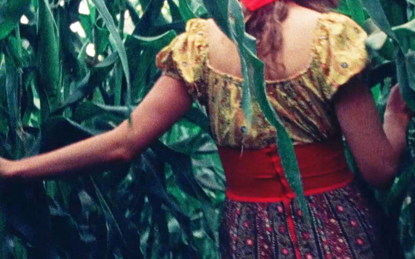
Here is a perfect two-minute film that I had to play twice. It is composed of still images of Sharon, the director’s sister, as she walks through a cornfield. We initially see her along the perimeter as dissolves alternate between shots of her in and out of the frame, anticipating her entry. And then suddenly we’re inside, following her as husks fill the frame. Her red attire shines through all the green, and the soundtrack—layers of minimalist flute melodies played by Don Morstad—mirror the whimsy of Laughlin’s rapid cuts. Before long we’re out the other side: a brief and playful moment beautifully rendered. —Joshua Minsoo Kim
I watched Susan Through Corn at the NYPL. Its call number is “M16 A-569 S”.
Group V: Endurance / Remembrance / Metamorphosis (Barry Gerson, 1970)
I watched Barry Gerson’s Group II: Water/Contemplating while at the NYPL last year and I have been chasing the high that Water provided ever since. This triptych doesn’t quite get there, but the first film, Endurance, comes close. It features an interior shot of gossamer curtains as they lightly move, occasionally appearing in frame. Light comes through the window and arrives as golden browns on hardwood flooring. It’s sensual in its simplicity: film as a magnification of everyday textures, light, and movement. Remembrance finds Gerson shooting in a more direct manner—from inside a house, in front of a window, and out into a yard. He moves his camera with the sort of gentleness meant to evoke a childlike admiration, but it’s a bit too sentimental for me. It’s more evocative when the camera is largely fixed, as in Endurance; one gets the feeling of a world suffused with life, instead of an artist animating what is around him. Metamorphosis finds a middle ground, racking focus to highlight different plants in a frame, which positions this as a clear precedent to Georges Rey’s Fleurs. —Joshua Minsoo Kim
I watched Group V: Endurance / Remembrance / Metamorphosis at the NYPL. Its call number is “M16 A-261 E”.
The Loom (Stan Brakhage, 1986)
This is one of the more frustrating Brakhage films I’ve seen as it never quite lives up to its most beautiful moments. (It should be noted, though, that J. Hoberman said in 1987 that it was Brakhage’s strongest non-narrative work since 1974’s The Text of Light.) The film is defined by its numerous superimpositions, all of which are centered around an enclosure featuring various animals: geese, roosters, chickens, goats, a cat, and more. It is a slog to sit and watch these creatures walk around, but there is occasional beauty in how these images are overlaid (there is a sort of easygoing atmosphere that this footage provides, which serves as important foundation to build on, but it is not enough to warrant such an extended 40+ minute runtime).
I am particularly fond of the sensitivity with which dissolves occur: we’ll see the moody blue or white light from an incoming image arrive, flickering for a second or gracing the screen for a little longer. At other points, it looks like beams of heavenly light are bursting from the screen; about nine minutes in, there are blue, green, and orange-red rays emanating from the top of the frame. This sacrosanct feeling goes hand in hand with the images: notice the sheer beauty of these animals simply existing, Brakhage seems to suggest. That’s felt more deeply in The Loom’s strongest moments, all of which involve hand-painted film. They look like spellbinding flames in some passages, and an array of rainbow-colored crystals in others. It is the most tender link Brakhage ever made between his hand-painted works’ poeticism and the real world. And despite how overlong it feels, The Loom still feels like required viewing for that reason alone. —Joshua Minsoo Kim
I watched The Loom at the NYPL. Its call number is “M16 4023 L”.
Highway Landscape (J.J. Murphy, 1972)
Highway Landscape is a single-take film that finds J.J. Murphy positioning his camera on Iowa Highway 1. Asphalt takes up the bottom layer of the image, and a dead rabbit can be viewed in the bottom right corner of the frame. The remaining space is filled with leafless trees and empty sky. The shot is evocative already, especially as the rabbit’s fur can be seen fluttering in the wind, but cars periodically pass and the accompanying noise provides intermittent shock. It’d be a fine piece of minimalist field recording from the audio alone, but the image presents the scene as one of unknown loss: the bunny’s carcass is left to rot, and everyone else is going about their day, a car probably having killed this animal in the first place. It’s a simple depiction of life and death in the most familiar of spaces. —Joshua Minsoo Kim
I watched Highway Landscape at the NYPL. Its call number is “M16 A-309 H”. The print is faded; you may have better luck with the print at the Film-Makers’ Coop.
Heliography (Hiroshi Yamazaki, 1979)
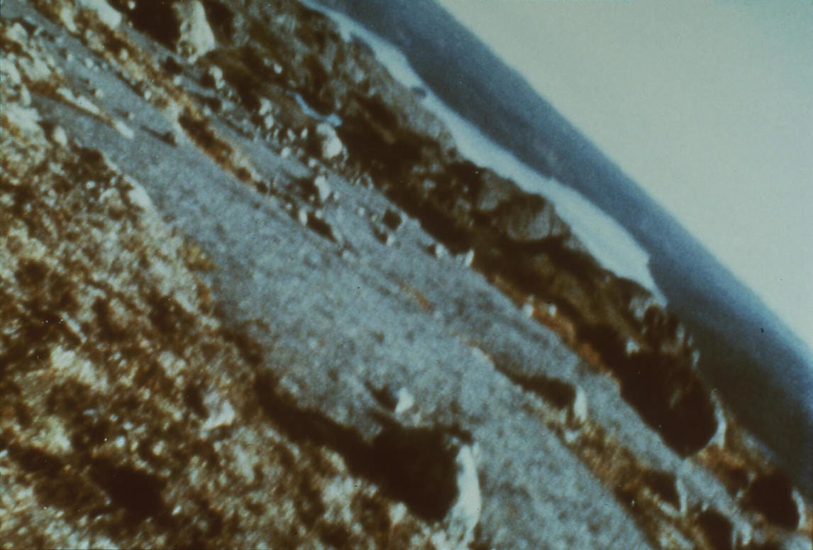
The biggest disappointment of my trip to NYC was watching Hiroshi Yamazaki’s Heliography and immediately recognizing that the print was faded. I was looking forward to this film, which has been online for some time in a miserable lo-fi quality, because it does not feel like the sort of work that can be viewed in a context outside of 16mm projection. With its canted angles and time-lapse images, Yamazaki makes the sky and sea feel interchangeable, like we’re gods peering into this bizarre creation: the city looks alien, and the clouds drift in a mesmerizing swirl (the unwavering, unemotional drone is a fitting soundtrack). The print was so bad that I feel like I wasted my time; maybe one day. —Joshua Minsoo Kim
I watched Heliography at the NYPL. Its call number is “M16 A-465 H”. The print is faded.
Skye Boat for Biscuit (Beverly O’Neill, 1973)
The only information I could find online about Beverly O’Neill’s Skye Boat for Biscuit was a short review in a 1979 issue of the Hartford Courant. Doris Whitbeck describes the work as painterly, comparing it to Claude Monet’s paintings. I don’t find the film nearly as colorful, and consider its dreary palette of greys and greens appropriate for its stately mood. We hear bagpipes play “The Skye Boat Song,” a Scottish folk song, for O’Neill’s dog Biscuit. This soundtrack continually plays, instilling melancholy across images of rain hitting water and then rippling outward. With time-lapse images of varying speeds, we see clouds passing overhead and rain appearing as sudden torrential downpours, all while lily pads and grass remain largely stationary. The manipulation of these images is obvious and jarring, and the flickering nature of these shots combined with the austerity with which they’re approached positions Skye Boat, in some sense, as proto-Rose Lowder. Seek it out. —Joshua Minsoo Kim
I watched Skye Boat for Biscuit at the NYPL. It is listed as Skyeboat for Biscuit despite the title card having a clear space between the first two words (it is dated as 1973, too). Its call number is “M16 A-189 S”.
Stately Mansions Did Decree (Stan Brakhage, 1999)
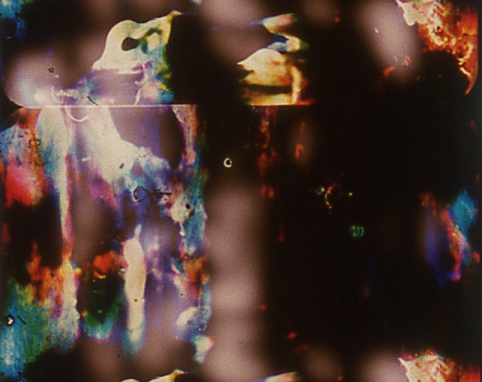
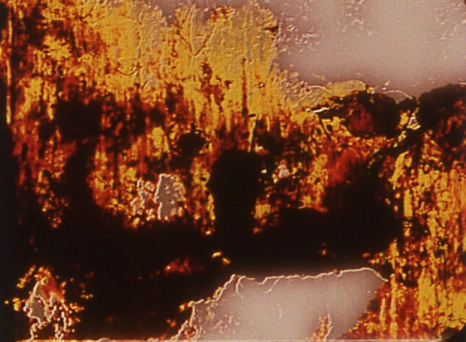
This is an exceptionally great hand-painted film from Brakhage, and easily among my favorites (we’re talking upper echelon, near-For Marilyn territories here). The title refers to Samuel Taylor Coleridge’s “Kubla Khan” and the film was influenced by JMW Turner’s Petworth Park paintings. (Jennifer Reeves, a director I write about later in this post, wrote about the film for the Chicago Review in 2002.) With regards to the poem, one can sense how much Brakhage cares about using texture to capture specific landscapes and structures, while the watercolors Turner made of the English locale have radiant browns that allow sky and land to feel connected. This feels relevant, not just for the yellowish browns that open Stately Mansions Did Decree, but because the work is largely defined by a notable seam that runs vertically across the frame. Its existence provides both tension and release, creating structure but teasing how both sides of the frame could collapse into one.
Immediately before seeing this film, I watched Brakhage’s Occam’s Thread (2001), which is largely interesting for how a black strand of paint is always running from the top to the bottom of the frame. It allows for a specific point at which one can fix their eyes throughout the film. Stately Mansions provides a similar “guided” viewing because of this nearly imperceptible line (the others I saw it with didn’t know what I was talking about, but Reeves did, assuaging any doubt). We see kaleidoscopic swirls of paint on the left and right sides of the image, and they occasionally seem to mirror—or at least dance—with one another. When the film ends with a rupturing of the space, and the paint running across the middle barrier, it feels cathartic. It helps that compared to many other Brakhage works, Stately Mansions is expertly paced, moving at a consistently fast speed to keep the evolving, volatile nature of the scene intact. —Joshua Minsoo Kim
I watched Stately Mansions Did Decree at the Film-Makers’ Coop.
Raindance (Standish Lawder, 1972)
Standish Lawder’s Raindance is one of my favorite experimental films I’ve seen. It takes John Halas’ 1956 short film The History of Cinema, and uses a specific clip from it that highlights how anthropological filmmakers have exploited Indigenous people. During this scene, rain falls to the ground, appearing as white diagonal streaks atop a blue background (it is black in Raindance). Then, as rain fills the screen, the background shifts horizontally and moves offscreen to the right. Lawder uses this specific moment, mirrors it, and then has these two sheets of rain collide with each other to create dazzling light patterns. In a lecture that Lawder gave in 1975 at the Carnegie Museum for Art, he explains that the film is most closely related to his interest in painting. “I liked its texture and its quality,” he says of that specific wipe of animated rain. He cut it out and played with it for a year, printing it, reprinting it, overprinting it, adding color filters and color loops, and more. There were about 35 generations of printing overall, and the result is astonishingly beautiful. The soundtrack, which was made by his friend and student Robert Withers, features squiggly melodies made on an ARP, and the layered audio loops congeal into a mass that aligns with the images beautifully. It is a masterpiece. —Joshua Minsoo Kim
I watched Raindance at the Film-Makers’ Coop.
Chrysalis (Ed Emshwiller, 1973)
Released in the summer of 1967, the 30th issue of Dance Perspectives was a special one titled Cine-dance, and featured numerous filmmakers—Maya Deren, Shirley Clarke, Stan Brakhage, Jonas Mekas, Stan Vanderbeek, and more—commenting on this new wave of dance in film. In his essay, Ed Emshwiller specifically notes the importance of this “cine-dance,” and how it must be more than what each medium can offer on their own. “When the dancer is used in film terms, rather than dance terms, space and time are flexible,” he explains. This is something that he explored in his first cine-dance, the 1959 masterpiece Dance Chromatic, as a dancer would appear and reappear on screen in a sort of pas de deux with colorful brush strokes.
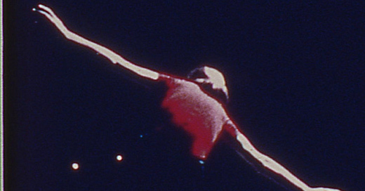
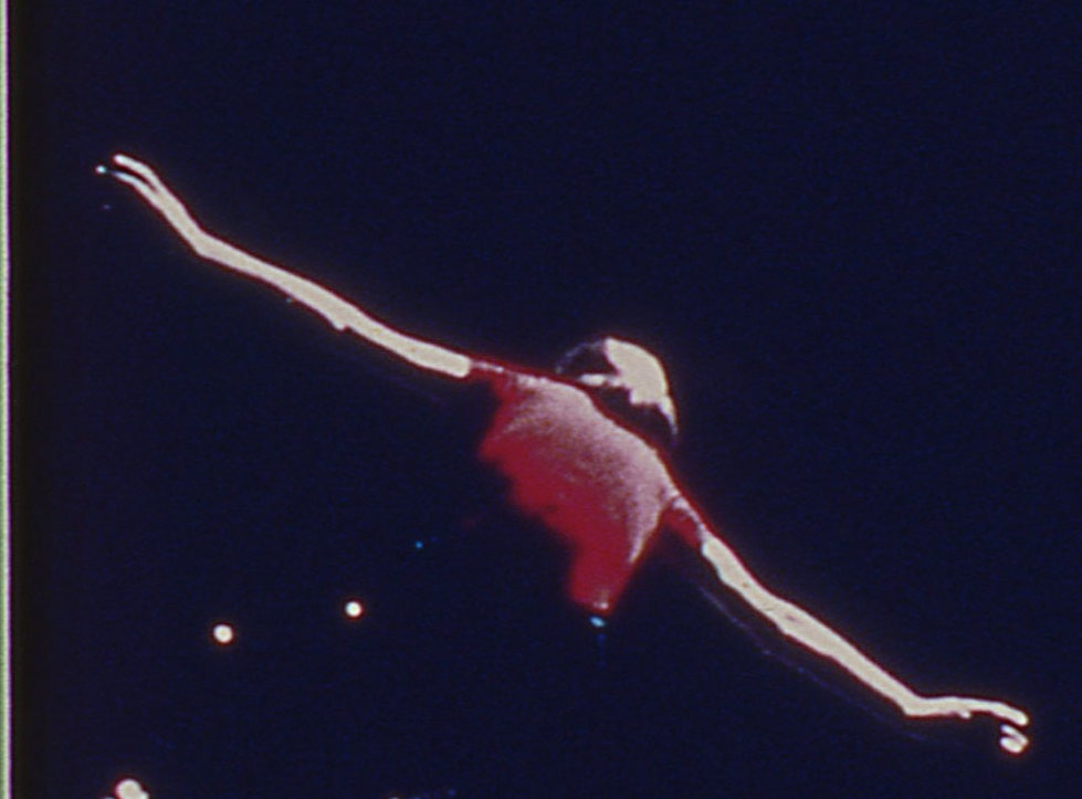
Chrysalis came after Emshwiller had already made a few other cine-dances, and should be considered one of his most ambitious, accomplished works. Made in conjunction with Alvin Nikolais and his dance company, the film begins with dancers inside gossamer fabrics (similar to a drawing he made for the Dance Perspectives issue), clarifying that these people are the insects that the title hints at. The soundtrack is filled with tape-manipulated extended vocal techniques mixed with piercing tones and other animal sounds (unless those were also from humans). The overall effect ranges from the haunting to the cartoonish to the sensual. I love that the soundtrack often just sounds like buzzing insects, and that the dancing channels the jagged movements and transformations that occur during such an evolutionary liminal state. —Joshua Minsoo Kim
I watched Chrysalis at the Film-Makers’ Coop. The print is faded.
Roseblood (Sharon Couzin, 1974)
I saw three films by Sharon Couzin during my recent trip and I was certain after viewing them that this legendary Chicago filmmaker—one who was the chairman of SAIC’s filmmaking department, cofounder of the Experimental Film Coalition, and created the Onion City Film Festival—should be recognized as a major artist. Roseblood was the film I was most drawn to, as it most succinctly captures a mode of filmmaking that works in the lineage of Maya Deren (this connection was also noted by Gina Marchetti and Carol Slingo back in a 1983 issue of Jump Cut). In the Cine-dance issue of Dance Perspectives, Deren explains that “dancing is not only a way of moving one’s limbs—it also brings the dancer into a different relationship to his surroundings.” Incorporating film then becomes a way to “put the entire world at the feet of the dancer.” I could feel this throughout Roseblood, not just because its use of a dancer is abstract and elicits grand emotions through specific gestures, but because the dancing feels at one with the editing. This is accomplished through a free-flowing arrangement of movement, the energized rhythm created through sharp cuts, and the varied framing of images (some shots use a fisheye lens, which she would revisit in 1981’s A Trojan House). There are superimpositions and alternating images that constantly flicker, and even drama in the form of a stabbing. The collage of images and the movement of one’s body become one, become boundless. —Joshua Minsoo Kim
I watched Roseblood at the Film-Makers’ Coop.
Metonic Cycles (James Cagle, 1974)
Metonic Cycles is a far cry from the immediate structuralist pleasures of James Cagle’s other works. It begins and ends with the same scene, which finds a man (possibly Cagle?) in a wide shot of a large expanse. He goes near a craggy hill to collect rocks. Then we’re in a home and see him slowly, methodically place these stones atop faces in Georges Seurat’s A Sunday Afternoon on the Island of La Grande Jatte. It’s an enigmatic sequence, and one that only becomes clearer when we then see hail fall onto the ground. Earlier, we the man shuffle through stills from Cagle’s own Waterwork—an incredible film that is little more than a patient zoom on roaring waters—which points to the constant reshaping and recontextualization of the world around us. When we see the initial rock-collecting scene repeat, Metonic Cycles reveals itself as a meditation on the cyclical ways we extract from, transform, and are beholden to the land around us. —Joshua Minsoo Kim
I watched Metonic Cycles at the Film-Makers’ Coop.
Nothing Happened This Morning (David Bienstock, 1965)
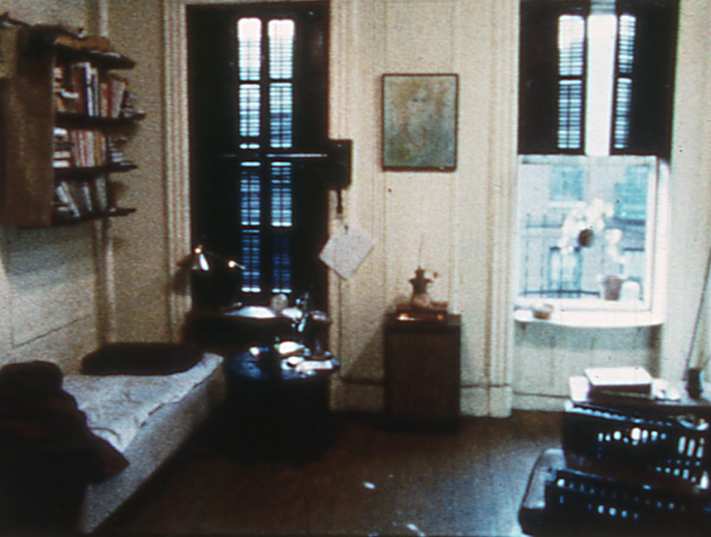
I know very little about David Bienstock. He was a curator at the Whitney, having introduced the New American Filmmakers series in 1970. He died at 29 in 1973 due to a self-inflicted revolver shot. He co-wrote the 1971 film Come Together, and then had short films: 1965’s Nothing Happened This Morning and 1967’s Brummer’s (there is potentially another called Longing made around the same time or before Nothing Happened This Morning, too). I had seen Brummer’s before—it’s defined by a mysterious narrative that gets disrupted by a series of playful, rapid cuts at the titular restaurant. Nothing is equally as dizzying, though the premise, as hinted by the title, is extremely simple. This is a film about the unseen rhythms of life. Bienstock captures the way your brain tries to make sense of reality as you’re awakened by an alarm clock and get out of bed, but also the excitement of drinking morning coffee and juice. He also captures the way a Vivaldi flute piece can animate your living quarters (and it’s notable that during this scene, the film moves from black-and-white to color). There’s a ticking clock anchoring the banality of this everyday scenario, but the edits reveal how much vibrancy exist in our lives, whether it’s the thoughts swirling in our head or the physiological reactions we have to drinking a beverage. At one point, he’s transported between his home and a coffee shop we see in the film’s opening scene; the desire and imagination of each day acts as our fuel. —Joshua Minsoo Kim
I watched Nothing Happened This Morning at the Film-Makers’ Coop.
Trains Are for Dreaming (Jennifer Reeves, 2009)
With Trains Are for Dreaming, Jenniver Reeves took eight super-8 films and combined them into a lively collage filled with alternating images. The constant stuttering suits the title, as watching these seven minutes can often feel like staring out a train window and seeing our view constantly disrupted by poles, trees, gates and whatever else that’s outside (there is, of course, a specific rhythm to staring out an automobile window that I’m happy this film really understands). While there are pop songs that occasionally play (positioning this as a lighthearted depiction of life’s many joys in the vein of Warren Sonbert’s 1989 film Friendly Witness), this is mostly a film that captures life as dream logic. This plays out in the form of seductive transformations and ambiguity: a goat seems to become a chicken, train rides lead to road trips in cars, and the soundtrack features the persistent sound of a train that, by the film’s end, make you wonder if they were actually the ambient noises of the sea. —Joshua Minsoo Kim
I watched Trains Are for Dreaming at the Film-Makers’ Coop as part of Diary Film NYC’s Building Steam With a Grain of Salt program.
Nimbus (Gary Doberman, 1978)
I programmed Nimbus as part of Film Diary NYC’s “Building Steam With a Grain of Salt” event, and I learned in the process of getting it approved for screening that the poet Robert Creeley wanted to write about the film. Gary Doberman rejected the idea because he felt it wasn’t finished, and Creeley wrote about Domicile instead (Doberman regrets saying that now, of course). This anecdote is especially funny to me because after the film ended, I heard someone in front of me say, “that’s it?”
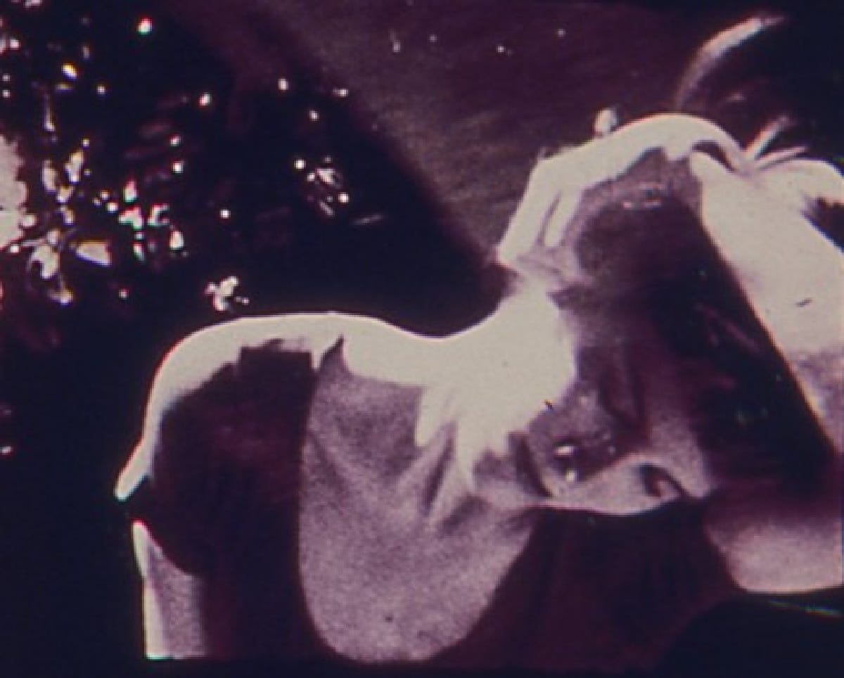
There’s something evocative about a domestic film that feels like an “unfinished” home movie. What specific requirements are needed for one to feel that one is complete—is it the runtime, the number of actions onscreen, the number of years captured on film? I ask these questions because I understand such sentiments, and am trying to parse them myself. But with how little actually happens in this five-minute film, there is some semblance of structure. The film begins with a cat investigating a pair of underwear on the ground, and these shots are alternated with those that are more mundane. We then see Doberman film a woman, presumably his partner, as she is in her undergarments. These are interspersed with shots in public settings, mirroring what we had seen before.
Doberman wrote a screed titled “New York Cut the Crap” that bemoaned structuralism and said the following of Michael Snow and the critics who adored him:
Michael Snow’s films (like certain painters) suffer from a too easy belief in analytical geometry; easily recognizable detachable structural parts with an overall geometrical composition: Standard Time, Wavelength, and Rameau’s Nephew According to Diderot with Thanks to Andrew Young. The end product is an easily recognizable consistent style for the critics who desire each filmmaker to maintain a rigid style of making throughout his career. This packaging has caused critical visual senile dementia (Senile is defined as having advanced in reduction by erosion to a featureless plain that stands everywhere at base level) and the subsequent refusal to seek out the imaginative workings of each individual film.
I mention all this because it is interesting viewing Nimbus and to still see some semblance of “structure.” The difference, of course, is that Doberman doesn’t opt for an overt formalism and is eager to let these things come together in a more natural manner. I said at the screening that I am a firm believer in understanding each person from both the things they love and the things they hate. It is just funny to me that at the end of the day, what he hates isn’t really so far from what he loves. That’s the arts, baby. —Joshua Minsoo Kim
I watched Nimbus at the Film-Makers’ Coop as part of Diary Film NYC’s “Building Steam With a Grain of Salt” program. I programmed this film.
Sentiment (Myrel Glick, 1979)
Myrel Glick’s Sentiment is a seven-minute black-and-white film made in homage to the director’s late mother. It features simple footage of the two that was recorded between 1950-52, of which there is presumably very little, and what we see could very much be considered photographs as there is very little movement. We see Glick as an infant in a crib as her mother looks after her. Later there is a shot of Glick on the beach. Given this is a silent film, Glick is not trying to make Sentiment feel overly emotional, and it can feel like a lot is lost on the viewer because there is little room to understand their relationship. What we have, though, are shots of the footage in a degraded state and scant flickers the scan across the images repeatedly, as if Glick is constantly trying to see this footage anew. There is a sense that she is looking at all these images and grasping for meaning herself, trying to build a connection through what little physically exists of their time together. There’s a shot near the end where we see the film projected on a screen, pointing towards Glick engaging in the same act as us. And then the camera suddenly zooms out and we’re left with the image as a small square: a visual representation of how these memories of her mother are always at risk of disappearing. —Joshua Minsoo Kim
I watched Sentiment at the Film-Makers’ Coop as part of Diary Film NYC’s “Building Steam With a Grain of Salt” program. I programmed this film.
La Région Centrale (Michael Snow, 1971)
A decade or so ago I used to put on La Région Centrale (or James Benning’s small roads) whenever I needed to sleep, so my understanding of Michael Snow’s three-hour masterwork has always been related to a sort of soporific hypnotism. And indeed, in seeing this on film at Museum of the Moving Image’s large theater was exciting for how I could experience it “for real.” I have never quite related to folks who have been swept up by its movements—I feel a lot more struck by the kinetic nature of Snow’s Back and Forth and Cityscape than anything that happens here. And that is, really, what I am taking away from this particular viewing experience: an appreciation for how Snow can push us to the edge of cinema and understand its limitations. I love the film’s initial stretch, how its slow, creeping movements position the viewer in a state of curiosity and exploration. By the time we see the landscape rotate clockwise, it feels as if we are no longer actually watching film, but witnessing something closer to photography. I did not feel dizzy or in awe of what was happening during this moment of the screening, and instead felt constrained by the existence of a frame; I craved for an expanse that stretched beyond what was visible.
I imagine many would interpret such an experience as negative but this is what has always drawn me to Snow’s works: an ability to distill elements of the filmic medium to understand the breadth of their capabilities. I love that after the first reel (about two hours) we are looking at what seems like an imageless screen, and are simply hearing the soundtrack (Morgan Fisher’s Picture and Sound Rushes would come out a couple years later, but Snow was able to place such ideas into a much larger context here). The music, which is likely my favorite avant-garde soundtrack ever, is the exact sort of minimalism I adore: it is austere and completely unconcerned with providing an audience with emotional or narrative arcs to latch onto. It is much like the image track in that way: this feels like an alien cinema, not because it is cold and confounding, but because it feels like a strange entity that simply exists. —Joshua Minsoo Kim
I watched La Région Centrale at the Museum of the Moving Image as part of their Jeanne Dielman and Its Roots program. A 16mm print of the film is available at the Film-Makers’ Coop.
Hotel Monterey (Chantal Akerman, 1973)
The final film I watched in New York was Chantal Akerman’s Hotel Monterey. I had seen the film before, and knew coming into it that it would be an amusing end to my week—its slow pace already feels funny after a day of programming that includes La Région Centrale and Wavelength, but this would be a necessary “come down” after so much binge-watching. I have always considered the film uneven, and have always found it upsetting that Akerman doesn’t end the film with the completely white shot of the sky once we’re outside the titular hotel, but so much of these 65 minutes are about capturing a specific tone and establishing expectations. There is a physiological effect that all the silence and static shots have, and you become hyperaware of it, feeling its slowness in a productive way. There is one sequence that makes everything worth it: suddenly, and repeatedly, Akerman employs the most seductive tracking shots in a small hallway, the light reflecting off the painted walls in the most lustrous manner. It’s as if the entirety of the film is Akerman priming you for these shots, to feel the full weight of its movement, the full beauty of its color. —Joshua Minsoo Kim
I watched La Région Centrale at the Museum of the Moving Image as part of their Jeanne Dielman and Its Roots program. The film can be viewed on the Criterion Channel.
Thank you for reading the 29th issue of Film Show. See you in the pit (screening room).
If you appreciate what we do, please consider donating via Ko-fi or becoming a Patreon patron. Film Show is dedicated to forever providing its content for free, but please know that all our writers are paid for the work they do. All donations will be used for paying writers, and if we get enough money, Film Show will be able to publish issues more frequently.

