Film Show 041: Avant-Garde Horror Films
Alex Fields breaks down 20 films that bridge horror and the avant-garde
Horror and the avant-garde share natural affinities. Many of the techniques used by experimental filmmakers, from strobing flickers to physically altered film strips, have an inherently disorienting—if not frightening—effect, and both traditions thrive in the territory of the obscure and unknown. Horror films have often been confined to specialty midnight movie screenings and the counters of video stores; experimental films likewise play to a niche audience whose enthusiasm for physical media and old-fashioned projection have survived broader changes in the industry. And of course, horror films have familiarized millions with sounds developed by avant-garde composers and pioneering electronic musicians.
The hope of this list is to break through some of these barriers and expand the horizons of horror beyond what is marketed in that framework. In this spirit, there’s no definition given for what counts as “experimental,” but the following list excludes films that have received commercial distribution and widespread recognition. Not all of these films are intended to frighten, not all of them were conceived as horror films, but all of them are appropriate Halloween season viewing. —Alex Fields
Cuadecuc Vampir (Pere Portabella, 1971)
Created on the set of—and as a parallel production to—Jess Franco’s 1970 Dracula adaptation, Cuadecuc Vampir blends outtakes and behind-the-scenes footage into a seamless montage. But this is no Brechtian attempt to cleave the viewer from the artifice of narrative: cinema’s “lies” and the means of their construction are undifferentiated, forming at once an opaque documentary about the vampiric nature of the camera and an eerily beautiful take on the Dracula story. It recalls the elusive fog of Dreyer’s Vampyr much more than the Euro-horror stylings it leeches from.
Director Pere Portabella obscures his source material through a variety of techniques including film negative, overblown light, and negative space, then cleverly cuts between “narrative” and “documentary” shots, erasing the perceived difference between the two. The sound design is essential: there is no live or diegetic sound, but a carefully manufactured soundtrack of ominous hammers, drills, and drones, broken a couple of times by witty musical irruptions that underscore the artist’s control over the audience’s experience.
These moments insert hope into the film’s otherwise bleak political allegory: made during the final decade of Spain’s fascist regime by an artist who was later a senator, Cuadecuc is an indirect commentary about the fabrications of the regime as well as those of cinema. Its Dracula is a looming dictator casting his shadow over every scene, a decrepit evil consigned to a coffin. This context gives the film’s conclusion—where Christopher Lee delivers the film’s only dialogue by reading Stoker’s lines about Dracula’s death—a doubly powerful impact. —Alex Fields
The Act of Seeing with One’s Own Eyes (Stan Brakhage, 1971)
The work of Stan Brakhage represents not a single revolution but a series of major developments in the language of the avant-garde. His exuberant explorations in the relationship of light and moving image to human thought and experience take film to places it had never gone before, sometimes quite literally, as in his depiction of his wife’s home birth in Window Water Baby Moving (1959). In The Act of Seeing with One’s Own Eyes, Brakhage moves to the opposite end of the life cycle and films up close inside a morgue as pathologists conduct autopsies. Through a half hour of footage we witness the slicing and unraveling of recognizable human form into flesh and bone and tissue. Brakhage films in a spontaneous style, with frequent cuts and no soundtrack, aiming to present as raw and unfiltered an experience as possible. The Act of Seeing is a visceral reckoning with mortality that confronts us with the terror of our own inevitable demise. —Alex Fields
Dyn Amo (Stephen Dwoskin, 1972)
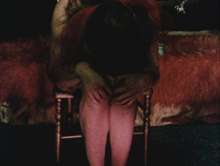
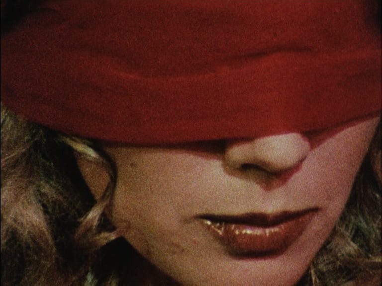
Dyn Amo is a foundational text for questions about the camera’s exploitative gaze and the film audience’s voyeurism. Director Stephen Dwoskin explores typical second-wave feminist ideas around the violence of sexual consumption, but he’s also interested in the private-public divide in our experience of desire and fantasy. In an abstracted peep show, the film uses stripping and lap-dance performances to explore the unbridgeable gap between our self-image and the image we project for others to see. Dwoskin uses telephoto shots to craft shaky, intimate close-ups that emphasize fragility, which creates an intensely emotional crescendo through his scenes’ long durations. Far from sexy, it is a bleak work that accumulates terror through haunting images of desperate people dancing alone. —Alex Fields
Spacy (Takashi Ito, 1981)
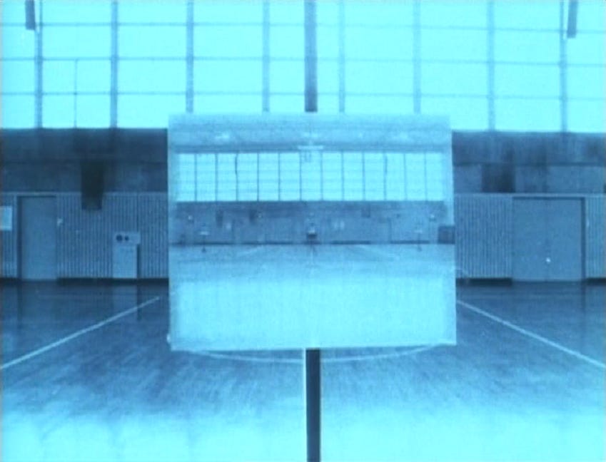
Artist Takashi Ito shot Spacy in a dark gymnasium, empty except for an array of tripods holding up images of the same space. The camera rushes toward or away from these shots, which then consume and repopulate the screen at an ever more frantic pace. Built from a series of flashing stills that are slowed to a visible frame rate, it studies the perception of space and time in film. It echoes the more experimental works of Ito’s mentor, Toshio Matsumoto, and is also reminiscent of North American structural film, but it’s delivered as psychological horror—the foundations of cinematic perception collapse in on themselves in a photographic frenzy. Ito’s later films like Ghost (1984) and Grim (1985) use an even more explicitly horror framing for their explorations of visual space, generating supernatural presence from patterns of suspended light, but the terror of Spacy lies in its spiraling sense of disorientation. —Alex Fields
The Ravishing of Frank N. Stein (Georges Schwizgebel, 1982)
Schwizgebel's animation begins abstractly, with Expressionist smudges whose skull-like patterns dissolve into the familiar setting of Frankenstein's laboratory. The remainder of the film is a steady journey through a series of plain rooms, initially empty but gradually filling with geometric shapes which morph into shadowy humanoid figures. The Ravishing explores not the human fear of the monster, but the monster's fear of its emerging human consciousness, which echoes the development of the animation itself, infusing the act of creation with uncertain danger. The sudden conclusion, where the monster meets his bride, suggests a similarly ambiguous relationship between love and terror. —Alex Fields
Possibly in Michigan (Cecelia Condit, 1983)
At a glance, Possibly In Michigan might feel like a silly home-video cousin to David Lynch, with its bizarro villain and distorted voice effects. There’s a sinister undercurrent to her aesthetic that mirrors her thematic material: shes uses the guise of amateurishness to process sexual violence and the psychic damage of consumerist suburbia. In a long tradition of American horror, Cecelia Condit portrays a society trying to appear as an unblemished utopia, then mines its weirdest and most disturbing materials. Her work delights in the playfully bizarre, incorporating deliberately cheap effects, lo-fi voiceovers, and musical numbers. The film’s approach fits comfortably with a 21st century internet culture that delights in the surreality of memes and viral videos. —Alex Fields
The Black Tower (John Smith, 1987)
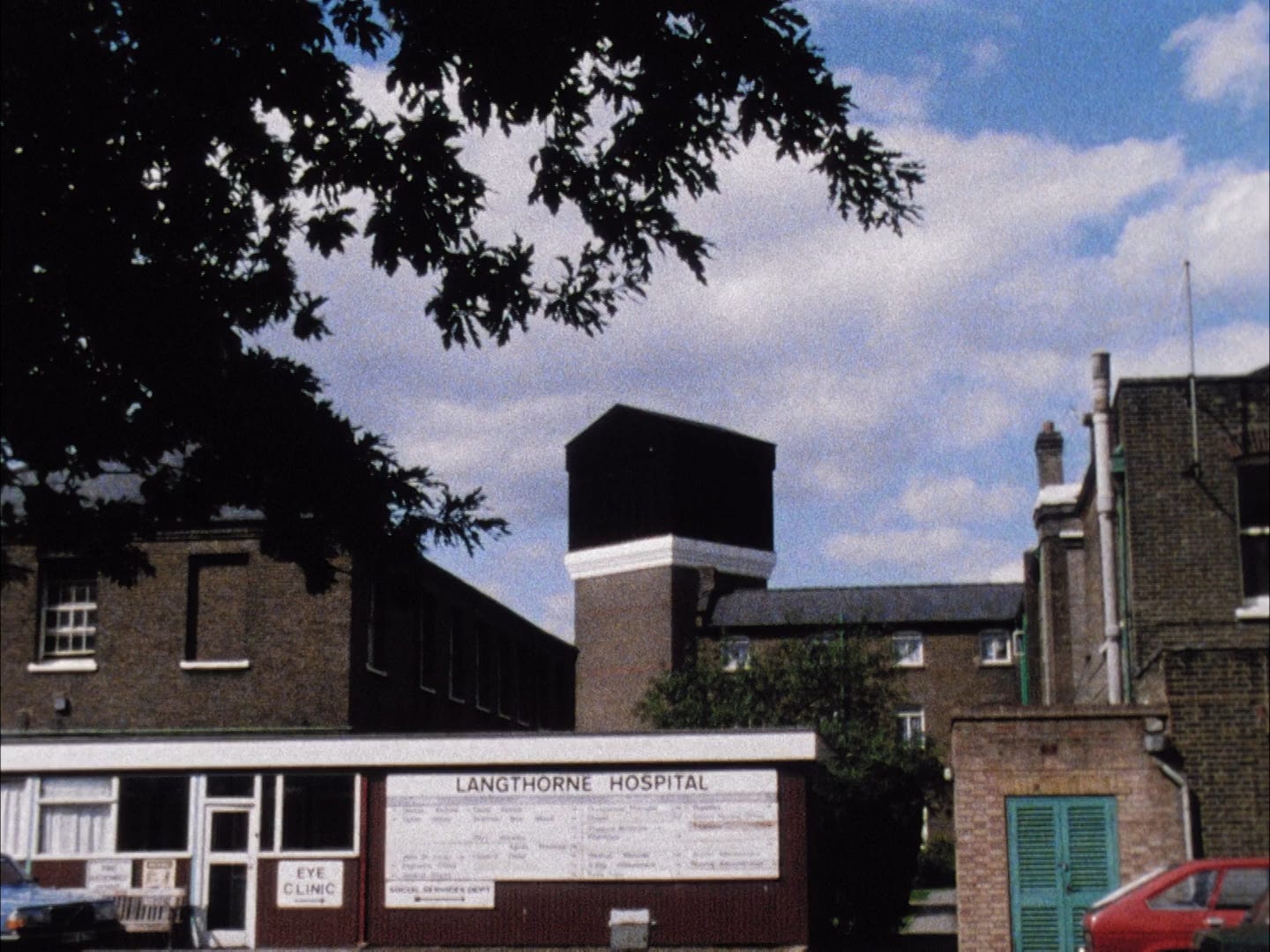
John Smith makes some of the most easily digestible films in the avant-garde repertory, casing highly formalist tendencies and sophisticated investigations of narrative in a very British dry humor. In The Black Tower, Smith supplements his usual wit with cosmic horror. He combines a story told by an offscreen narrator about a mysterious disappearing building with intricate structuralist visual tricks. Sound roots the images in a narrative context, and the images provide a winking counterpoint to the narration. This compelling, straightforward tale is recast into an elaborate puzzle, giving an amusing look at how we construct meaning from the overwhelming visual impressions of a city. —Alex Fields
Landscape Suicide (James Benning, 1986)
In the 1950s, Wisconsin farmer Ed Gein murdered two women and exhumed the corpses of others, using taxidermy to wear parts of their bodies. Thirty years later, high school student Bernadette Protti stabbed her friend Kirsten Costas to death in a northern California suburb. Landscape Suicide at first appears to be a true crime documentary about these killings with extended reenactments of police interviews and trial scenes. It eventually becomes clear that director James Benning is playing careful games with his material, making apparent the film's fabrications: sounds repeat in ways that reveal their artifice, documents are shown with their texts obscured. He lays out evidence in a clinical, objective guise while teaching his audience not to trust it, undermining the basic assumptions of true crime as a genre.
Just as the film invites us to analyze its own functions, it calls into question the words and actions of its characters as something legible even to themselves. Protti’s dialogue shows her thinking of herself in the third person, and Gein seems unsure of what he’s done or why, falling backing on excuses about fainting. Benning poses the operations of film and human beings alike as inherently structured by form and environment, casting epistemological doubt onto our understanding of art and social life in order to make visible the real complexity of both. He crafts a murder mystery where the mystery is not who or what but how and why. The mystery is perhaps unsolvable, but the film belongs in the company of The Texas Chain Saw Massacre and Twin Peaks as one of the great examinations of violence in the American landscape, and the lengths we go to avoid facing its roots. —Alex Fields
The Secret Garden (Phil Solomon, 1988)
The Secret Garden’s title recalls the Frances Hodgson Burnett children’s novel of the same name, but it could as easily refer to the wondrous cinematic space summoned by Phil Solomon. His techniques of chemical processing and optical printing create something entirely new from his borrowed reels of found footage, hinting at a composite story involving childhood trauma. The film teeters between the extremes of narrative and abstraction, wonder and terror. Flashes of subtitles mention a mother’s death and a plot for revenge, while faces of women and children appear as shimmering specters of light on celluloid then dissolve into a constellation of sparkling light. It feels as though Solomon has transported us to an alternate reality, a prismatic distortion of the past imprinted on the texture of celluloid. —Alex Fields
To Lavoisier, Who Died in the Reign of Terror (Michael Snow, 1991)
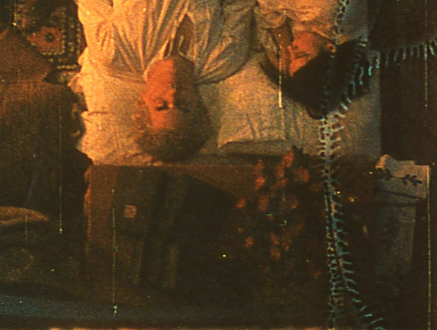
Like all of Michael Snow’s films, To Lavoisier poses fundamental questions about the nature of representation and wittily foregrounds the role of artifice, exploring the structures that mediate the relationship of artist and audience alike to the fictions created onscreen. Snow shoots long takes of ordinary, repetitive actions—people cooking, playing poker, or stoking a fire—and manipulates the film stock through chemical processing (with the aid of collaborator Carl Brown). The resulting images are frequently obscured beyond recognition, and the real “action” of the film takes place mostly on the physical surface of the celluloid in its elaborate flame-like patterns of color and distortion; any narrative in this case is a red herring.
The title of the work refers to the chemist who discovered the physical properties of fire and the law of conservation of matter, ideas played with throughout this work. In this case, the effect is as often frightening as funny. The soundtrack consists of crackling noise that resembles fire, and some of the images are haunting, as in an early sequence where a man’s casual repetitive arm motions appear to be waving off the “fire” that consumes him, which comes from the film’s processing and not the “reality” originally captured. Snow’s manipulations drive home the centrality of the medium itself to our understanding of art. —Alex Fields
Chants (Martine Rousset, 1995)
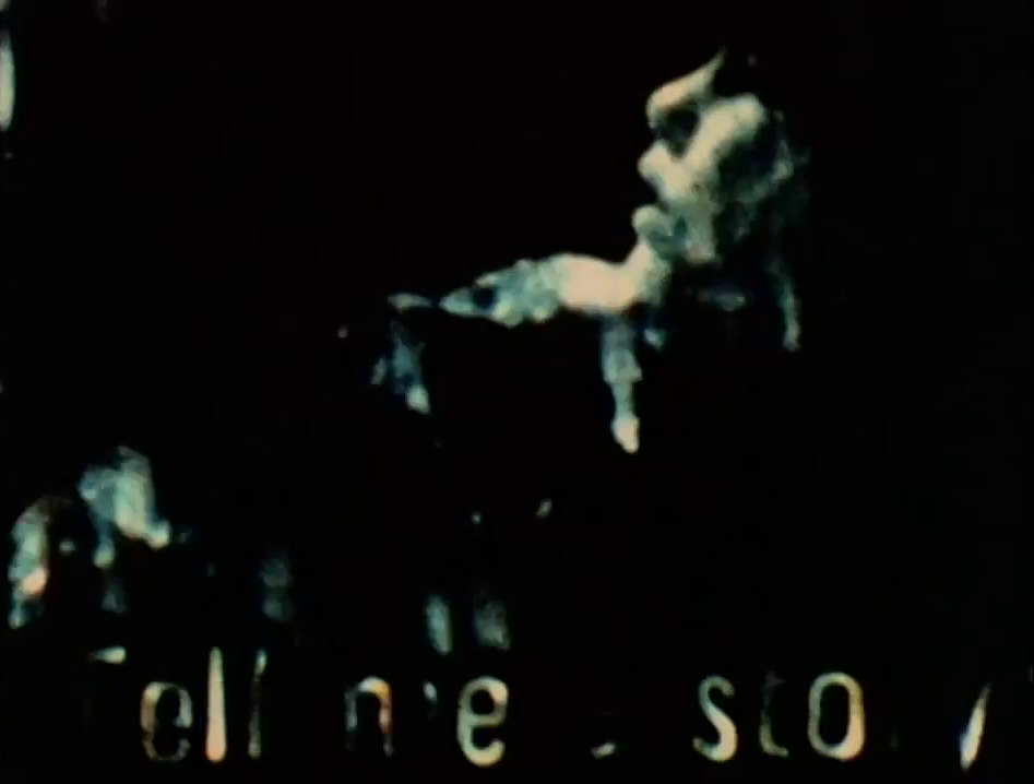
Martine Rousset’s films are built on absence and separation, on negative space literal and metaphorical. In Chants we see limited views of a woman’s face, a building collapsing, a statue consumed by flames, all lit by flickering light and fading into emptiness at edges of the frame. Sometimes the images are too obscured to recognize. A spare, atonal piano piece provides the only sound, underscoring the woman’s isolation. Her face is the framing device continually returned to and superimposed. Her expression is, to an extent, inscrutable, but her feeling is one of pain or sorrow, terror or confusion. The film’s other images work as a mysterious extension of her facial expressions, giving a sense of crumbling loss. The visible space darkens to increasing abstraction until nothing is left but existential horror. —Alex Fields
Outer Space (Peter Tscherkassky, 1999)
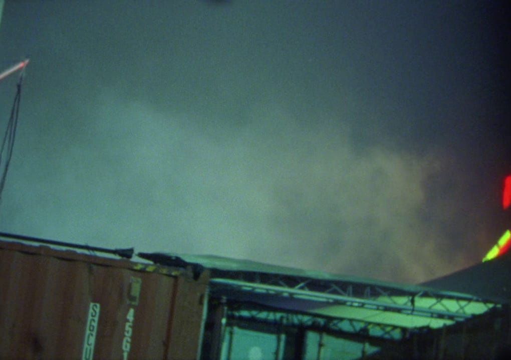
In Sidney J. Furie’s harrowing 1982 supernatural horror The Entity, a woman played by Barbara Hershey is haunted and sexually assaulted by a supernatural force representing sexual trauma. Peter Tscherkassky reconstructs this footage into a stratified swirl of branching and overlapping images that explore cinematic space and psychological fracture. Hershey’s character begins to shimmer and split in two, her house dissolving into a flurry of passing film fragments that mounts into a tornado. Furie’s “entity” is replaced by the film material itself, which pursues and consumes its character.
Outer Space is part of Tscherkassky’s ongoing investigation of the physicality and history of cinema, but it’s also a viscerally exciting thriller in its own right. It can be read as an expression of trauma, as a psyche splintering and battling for sanity, even as an abstract representation of the nature of fear. The internal narrative and metatextual components complement each other, as the film’s material self-examination opens narrative possibilities for the character, who literally does battle with the film frame by repeatedly smashing it. As Tscherkassky ruptures the barrier between onscreen narrative and audience, he places us as ‘characters’ in his film’s disintegrating nightmare. —Alex Fields
The Decay of Fiction (Pat O’Neill, 2002)
The Decay of Fiction is something like The Shining sans the Overlook’s living caretakers. The history of Hollywood narrative is imprinted on the cavernous spaces of an old hotel, the mythmaking mode as dilapidated as the physical structure. Pat O’Neill’s unparalleled virtuosity with optical printing techniques finds a focused outlet here, as does his obsession with the idea of image-making itself. The camera roams from room to room: it observes fragments of narrative, isolates classic film types and tropes from their generic context, and emphasizes their artificiality and interchangeability. Interludes of more limited visibility underline the spatial effect, granting these scenes an open and three-dimensional use of space. The building itself is the film’s glue and structuring force, as narrative elements are manipulated to flesh out three-dimensional space rather than the camera guiding us through the story.
The inversion shines a remarkable light on the language of conventional Hollywood film, where every movement of the camera and every cut is subordinate to the needs of narrative and designed not to distract. O’Neill uses pieces of self-contained narrative to emphasize his departure from these conventions.He eventually drops these, and the figures become specters of pure movement across the spaces of frames, which themselves are fluid as the camera that wanders about. Significantly, this switch occurs as we move down into a subterranean space occupied by the workers operating the hotel, suggesting the many involved in film production who don’t appear onscreen. The images repeat and falter, and sound fails to synchronize with the image for even the barest illusion of meaning: the hotel has no more vacancies. Suddenly, there’s an eruption of gunfire; the cinema is dead at its own hands, and all that’s left is the naked desire and madness of spectatorial gaze. —Alex Fields
Aspect (Emily Richardson, 2004)
There’s something inherently unsettling about Emily Richardson’s time lapse studies and the subjects she chooses: coastlines wheeling across a canvas of stars where human presence is reduced to flashes of passing light (Redshift, 2001), the emptiness of city streets at night (Nocturne, 2003). Framing the natural as unfamiliar and the human as insignificant are foundational moves for horror, and in Aspect, Richardson takes to the forest—a classic setting of foreboding tales—in an abstraction of a dark Brothers Grimm fairy tale. There are more overt genre elements here than in previous works, with a soundtrack composed of whistling wind, creaking branches, and eerie insects. The time-lapse photography sketches light and shadow and the trembling movement of trees as a force possessing the woods, and a number of sped-up zooms recall the skewed point-of-view manipulations of Dario Argento’s camera. The dark forces at work here are not supernatural, but the fundamental tools of cinema: light drawn in time. —Alex Fields
Light is Waiting (Michael Robinson, 2007)
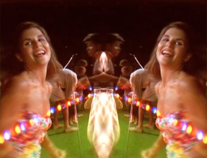
Michael Robinson’s idiosyncratic style could be called apocalyptic kitsch. He engages with popular culture, reworking source materials to generate entirely new meanings and affective responses. Cheesy songs or TV shows are elevated into sweeping expressions of serious emotions without downplaying what is silly and problematic in them. Light is Waiting reworks an episode of Full House, beginning with an extended unaltered clip of the kids moving a TV upstairs and accidentally dropping it, at which point the film erupts into a cybernetic meltdown of strobing light, axial symmetry, and distorted voices. The Tanner family's Hawaiian vacation becomes a nightmare ritual summoning the demonic spirits of capitalist culture, the exoticizing tourist tropes themselves loudly exoticized and isolated for critique. It’s both an ironic, wacky comedy about bourgeois family life and a loudly unnerving excursion through the horrors of consumption. —Alex Fields
Luna e Santur (Joshua Gen Solondz, 2016)
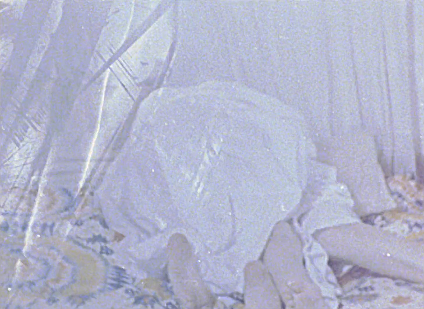
Luna e Santur is constructed from simple materials: photographs of two figures in white sheets, frames of scratched or painted celluloid, black and white light. These elements alternate to create a jagged and strobing sense of motion, conceptually indebted to the abstract flicker films of Paul Sharits. The film’s effect is immediate and visceral, but its profundity comes from its layered ambiguity. The hooded figures suggest both ghosts and torture victims, but the sheets they wear also have a more mundane association with physical affection. They inhabit a seemingly domestic space, and wrestle in a manner that could be sexual or combative. The flicker pattern alternates images from different sequences of action, the bodies twisting and contorting impossibly. Meanwhile, the flashing light and damaged film strips obscure the action beyond easy recognition, and the sheets alienate the figures from each other.
Solondz thus summons an array of thematic associations that are at once repellant, seductive, and spooky. The imagery invokes the supernatural, but the intertwined specters of intimacy, violence, and terror suggest it’s the ghost of trauma that the film seeks to exorcise. It’s this head-on engagement with the darkest and most deeply felt tremors of the psyche that makes Luna e Santur one of the most disturbing films in years. —Alex Fields
What Happens to the Mountain (Christin Turner, 2016)
What Happens to the Mountain is a throwback to the transcendental road movie, with a loose narrative that follows a character’s journey to a desert mountain. Screenwriter Caleb Addison developed the script after learning of a friend’s death, and it metaphorically traces a voyage into the unknown, perhaps the afterlife. What Happens to the Mountain suggests an alien force parallel or subsequent to our reality, made explicit in a radio broadcast about an out-of-body experience, and formally established by obscuring footage in clouds of grain or cycling it through a wheel of varied colors. Turner has a striking intuition for the power of sound and images transformed just beyond the point of recognition, and he cleverly plays with contrasts between terror and comedy, highbrow and camp. Toward the end, a narrator reads an extended passage from T.S. Eliot’s The Waste Land while the character ascends a mountain to witness a vision of flashing lights, emphasizing the film’s spiritual connection to psychotronic ’70s genre exercises and encapsulating its marriage of disparate styles. —Alex Fields
Ruins Rider (Pierre-Luc Vaillancourt, 2017)
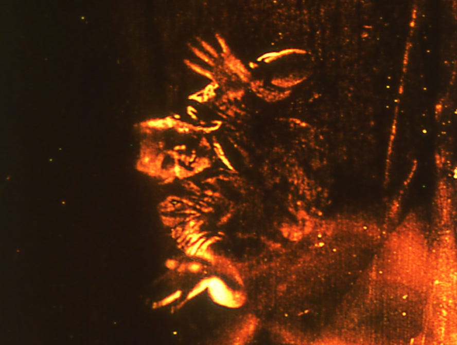
Pierre-Luc Vaillancourt’s spectral flicker film was shot in an area of the Balkan wilderness famous for inducing trance-like states in those who visit—an experience the film seeks to replicate. This is not a faithful study of a place or phenomenon—the setting is barely recognizable under the layers of manipulation—but a voyage in search of chthonic energies and the earth’s resonant substrata. The camera wafts through hilly stone ruins washed in blood red and rusted orange and bathed in hissing static. It feels like layers of metaphysical reality crashing into one another, all aggressive texture and sensation. Vaillancourt pushes this celluloid psychedelia as far as it can go, reducing physical space to a psychic state. —Alex Fields
Signal 8 (Simon Liu, 2019)
Simon Liu’s previous films have taken diaristic 16mm footage through a variety of optical printing and celluloid processing techniques, creating an effect that’s something like turning memories and fleeting experiences inside a kaleidoscope. Signal 8 is a sharp departure from this psychedelic style in a number of ways, not least of which is that for the first time, sound design is an integral part of the film’s conception and function. An unseen character’s idle singing, the sinister buzzing of electronics, obscured radio broadcasts referencing a disaster, and a Neil Young song with vocals warped give the city a post-apocalyptic inflection.
Those images consist of much more direct footage than Liu’s usual swirling layers, and he pulls out ordinary scenes of Hong Kong life, work, and infrastructure to recontextualize them as omens of science-fiction collapse. The film was made in 2019, the year of the largest demonstrations in the city’s history, and the political overtones are clear; Hong Kong is headed for disaster if nothing changes.
The two moments when the artist’s familiar exotic colors burst are realized fully in camera–in one case through a fireworks display–slyly nodding at the artist’s past work while also emphasizing this film’s departure from his usual post-production manipulations. This is appropriate for an artist whose works always play with contrast, and that play also underlies Signal 8’s ending, which delivers on the film’s genre trappings with an apocalypse as comical as it is uncanny. —Alex Fields
The Taking of Jordan (All American Boy) (Kalil Haddad, 2022)
Kalil Haddad delivers a grim and all-too-realistic riff on the fertile junction of sex and death, exploring the desires and perils of gay life. The Taking of Jordan presents itself as a docu-fiction, using what seems to be archival photographs and footage (much of which is pornographic, and some of which draw a thin line between sex and violence) but augmenting these with techniques from the avant-garde such as flicker and static landscape compositions. The documentary structure break downs as the film freely conflates the biographies of several different young men told through archaic captions, even alternating between different names (Jordan, Steve, Michael) for the character(s). Their stories involve youthful hopes dashed by a violently homophobic world, interweaving sex work, porn, human trafficking, and the AIDS crisis into a cycle of death and resurrection that invokes a mass tragedy in the lost hopes—and lost lives—of countless queer youth. —Alex Fields
Thank you for reading the 41st issue of Film Show. See you next Halloween.
If you appreciate what we do, please consider donating via Ko-fi or becoming a Patreon patron. Film Show is dedicated to forever providing its content for free, but please know that all our writers are paid for the work they do. All donations will be used for paying writers, and if we get enough money, Film Show will be able to publish issues more frequently.












Such a great resource, almost all of these are new to me. Looking forward to checking them out!